Grammar of data visualization
Lecture 3
Warm-up
Announcements
Office hours are posted on the course website!
-
If you can follow along with today’s application exercise steps, great! If something doesn’t work as expected, ask me/TA during the exercise. We’ll either:
- help you on the spot and get you unstuck or
- identify that you’re missing an earlier step, ask you to follow along with your neighbor, and visit office hours before Thursday for one-on-one help
Participate 📱💻
What is this a visualization of?


Scan the QR code or go to app.wooclap.com/sta199. Log in with your Duke NetID.
Outline
-
Last time:
We introduced you to the course toolkit.
You cloned your
aerepositories and started making some updates in your Quarto documents.You committed and pushed your changes back – at least most of you did!
. . .
-
Today:
You will wrap up that application exercis, and commit and push your final changes.
We will introduce data visualization.
You will pull to get today’s application exercise file.
You will work on the new application exercise on data visualization, commit your changes, and push them.
From last time
Tour: Quarto (and more Git + GitHub)
Option 2:
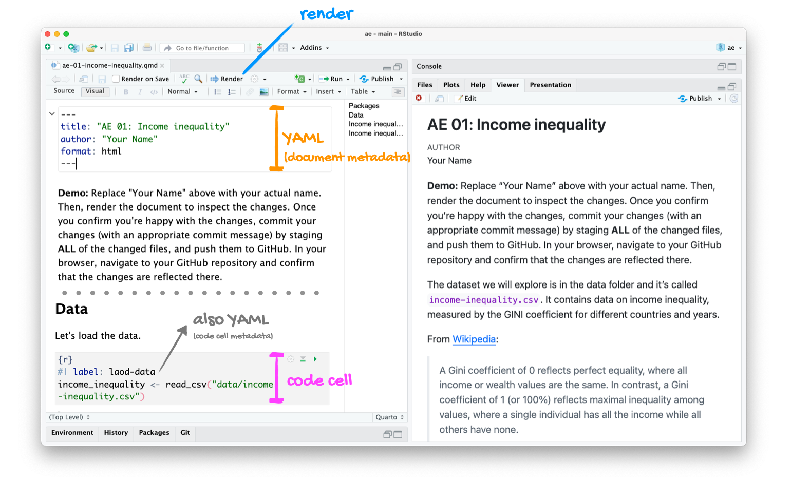
Go to RStudio and open the document ae-01-income-inequality.qmd.
Tour recap: Quarto
Tour recap: Git + GitHub
Once we made changes to our Quarto document, we
went to the Git pane in RStudio
staged our changes by clicking the checkboxes next to the relevant files
committed our changes with an informative commit message
pulled from GitHub to make sure we had the latest version of our repo
pushed our changes to our application exercise repos
confirmed on GitHub that we could see our changes pushed from RStudio
How will we use Quarto?
- Every application exercise, lab, project, etc. is an Quarto document
- You’ll always have a template Quarto document to start with
- The amount of scaffolding in the template will decrease over the semester
What’s with all the hexes?
We have hexes too!
Grab one before you leave!
![]()
Data visualization
Participate 📱💻
Remember this visualization from the code along video – what was it about?
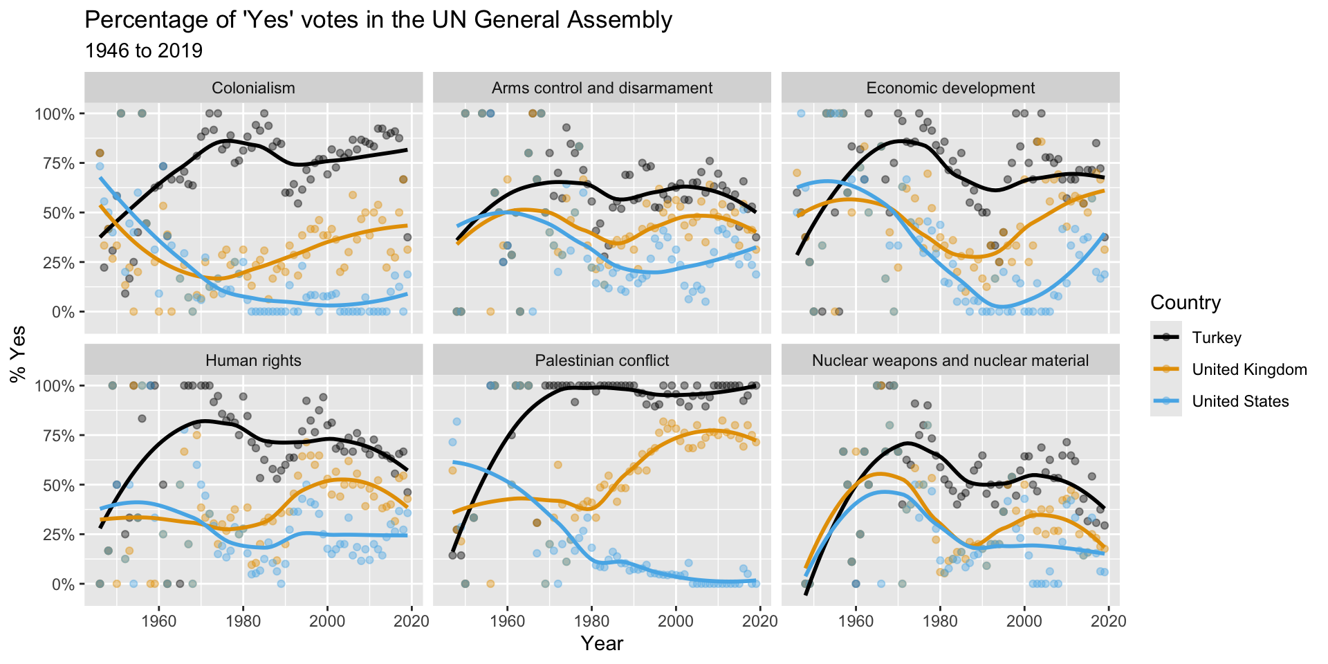
Scan the QR code or go to app.wooclap.com/sta199. Log in with your Duke NetID.
Let’ see…
how the sausage is made!
Load packages
Prepare the data
us_uk_tr_votes <- un_votes |>
inner_join(un_roll_calls, by = "rcid") |>
inner_join(un_roll_call_issues, by = "rcid", relationship = "many-to-many") |>
filter(country %in% c("United Kingdom", "United States", "Turkey")) |>
mutate(year = year(date)) |>
group_by(country, year, issue) |>
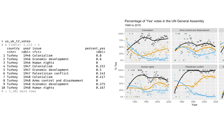
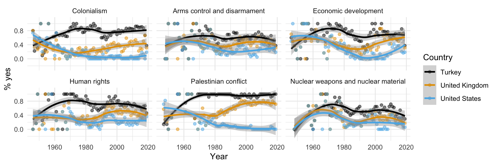
summarize(percent_yes = mean(vote == "yes"), .groups = "drop")Let’s leave these details aside for a bit, we’ll revisit this code at a later point in the semester. For now, let’s agree that we need to do some “data wrangling” to get the data into the right format for the plot we want to create. Just note that we called the data frame we’ll visualize us_uk_tr_votes.
View the data
us_uk_tr_votes# A tibble: 1,212 × 4
country year issue percent_yes
<chr> <dbl> <fct> <dbl>
1 Turkey 1946 Colonialism 0.8
2 Turkey 1946 Economic development 0.6
3 Turkey 1946 Human rights 0
4 Turkey 1947 Colonialism 0.222
5 Turkey 1947 Economic development 0.5
6 Turkey 1947 Palestinian conflict 0.143
7 Turkey 1948 Colonialism 0.417
8 Turkey 1948 Arms control and disarmament 0
9 Turkey 1948 Economic development 0.375
10 Turkey 1948 Human rights 0.167
# ℹ 1,202 more rowsVisualize the data
# code to visualize the data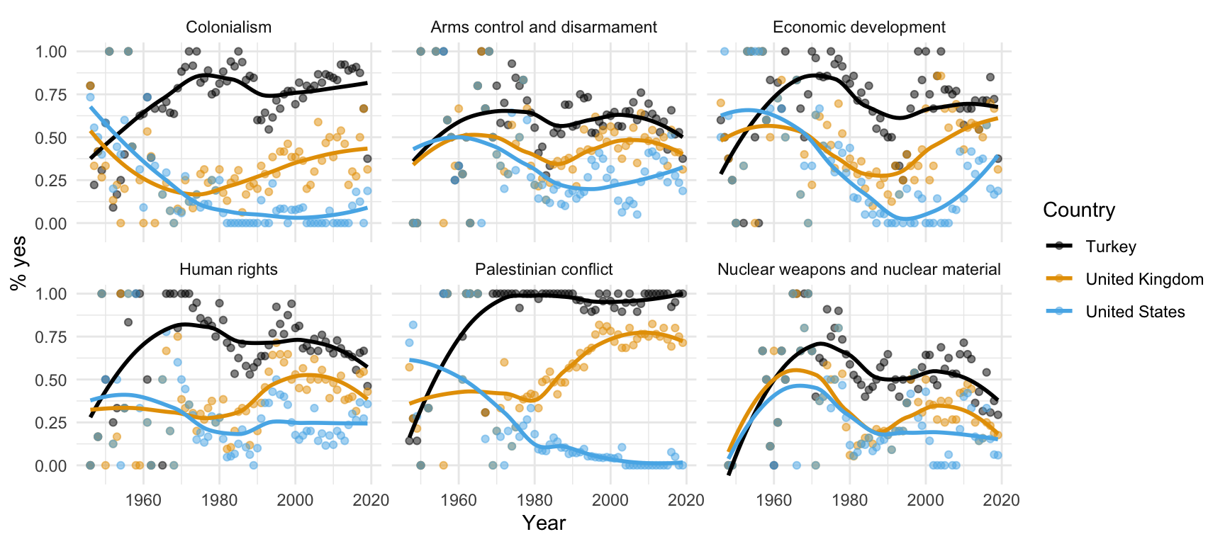
Step 1. Prepare a canvas for plotting
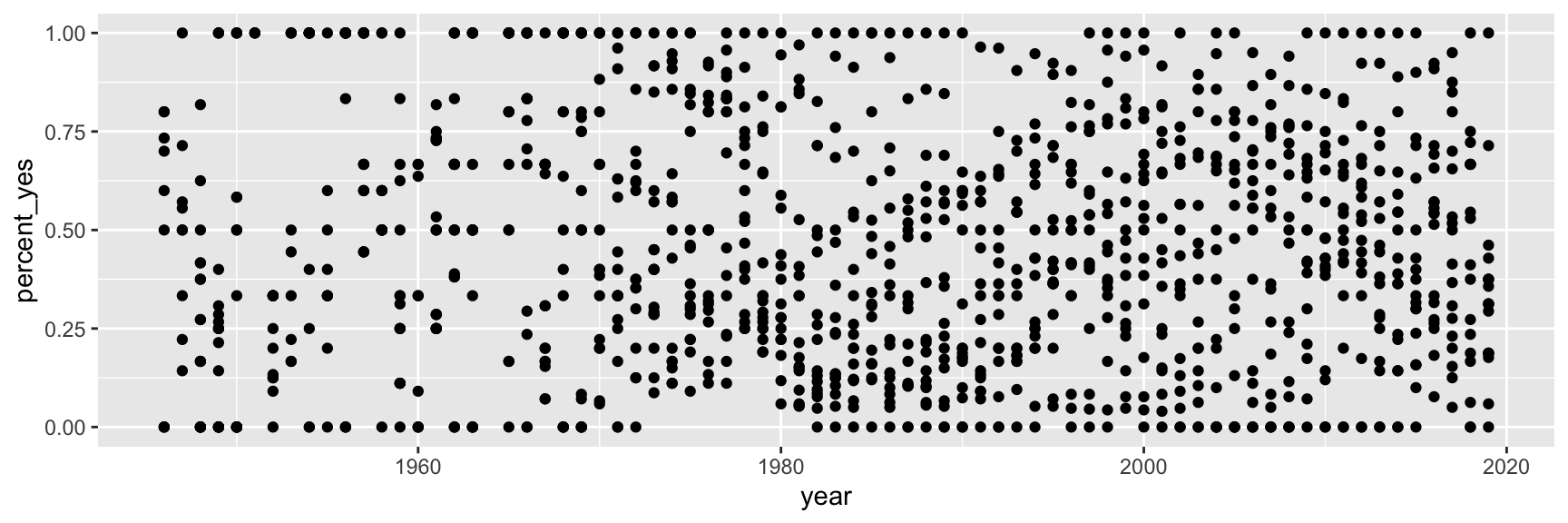
ggplot(data = us_uk_tr_votes)
Step 2. Map variables to aesthetics
Map year to the x aesthetic
Step 3. Map variables to aesthetics
Map percent_yes to the y aesthetic
Mapping and aesthetics
Aesthetics are visual properties of a plot
In the grammar of graphics, variables from the data frame are mapped to aesthetics
Argument names
It’s common practice in R to omit the names of first two arguments of a function:
. . .
- Instead of:
- We usually write:
Step 4. Represent data on your canvas
with a geom
Step 5. Map variables to aesthetics
Map country to the color aesthetic
ggplot(us_uk_tr_votes, aes(x = year, y = percent_yes, color = country)) +
  geom_point()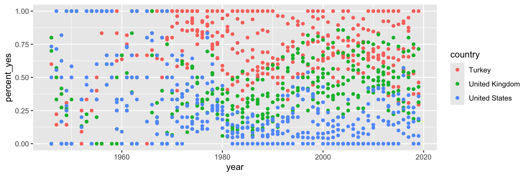
Step 6. Represent data on your canvas
with another geom
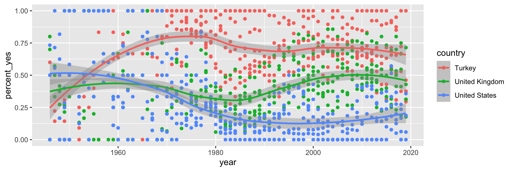
Warnings and messages
- Adding
geom_smooth()resulted in the following warning:
`geom_smooth()` using method = 'loess' and formula = 'y ~ x'. . .
- It tells us the type of smoothing ggplot2 does under the hood when drawing the smooth curves that represent trends for each country.
. . .
- Going forward we’ll suppress this warning to save some space.
Step 7. Split plot into facets
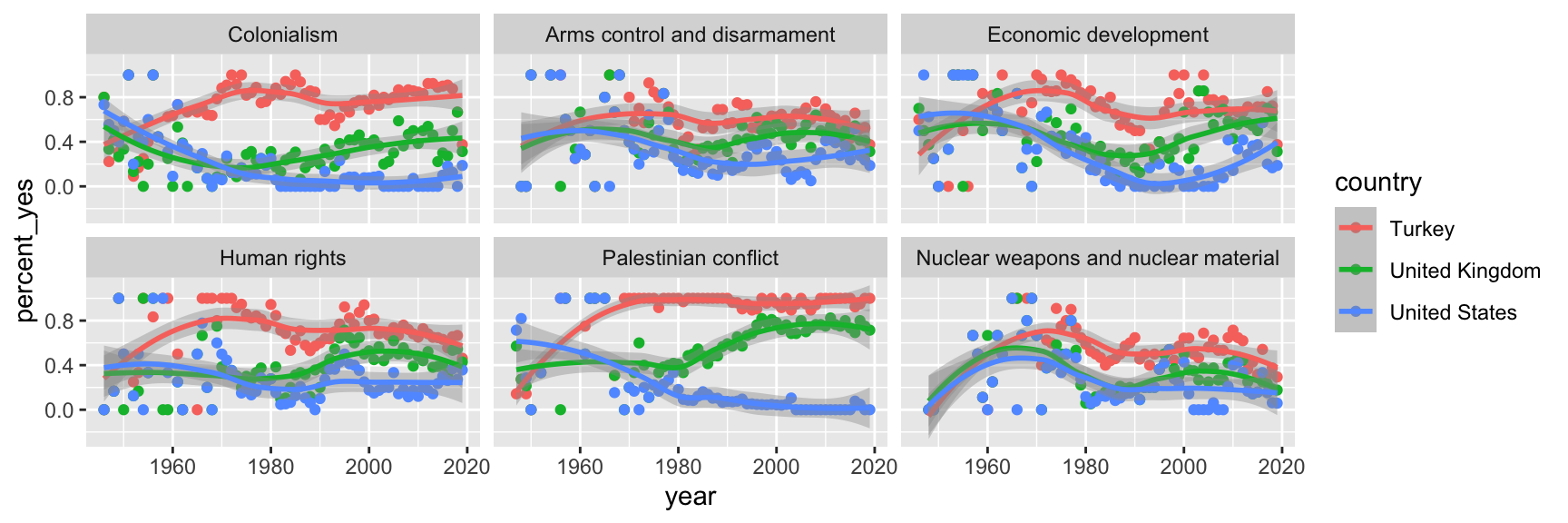
Step 8. Use a different color scale
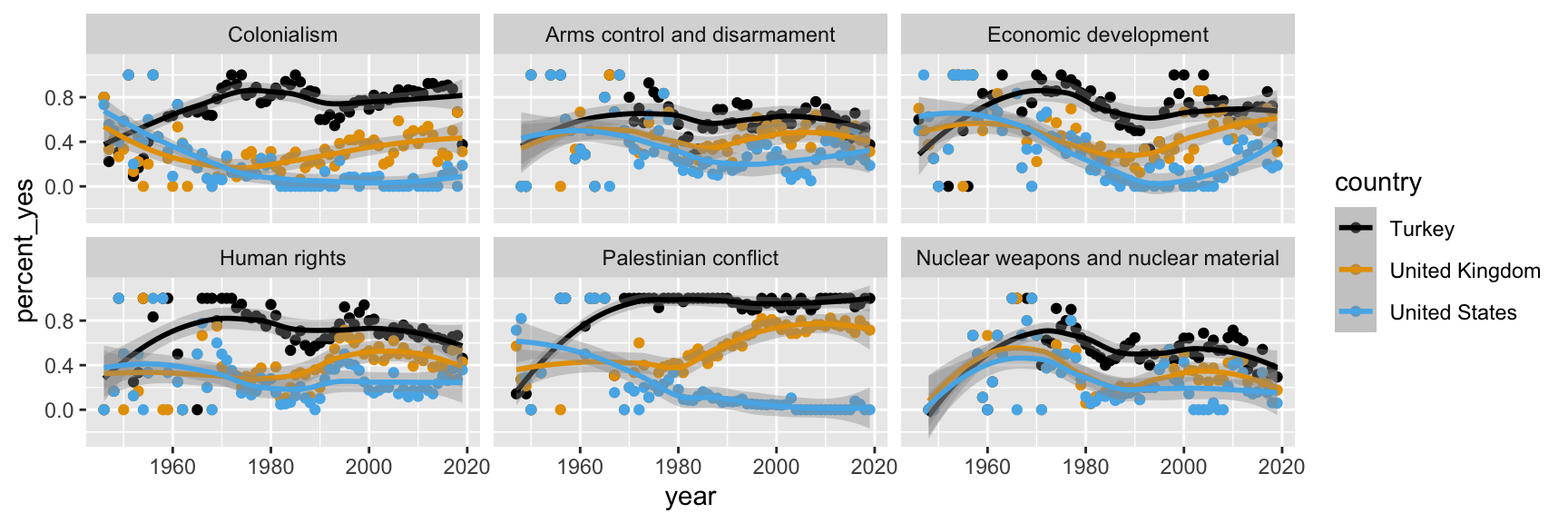
Step 9. Apply a different theme
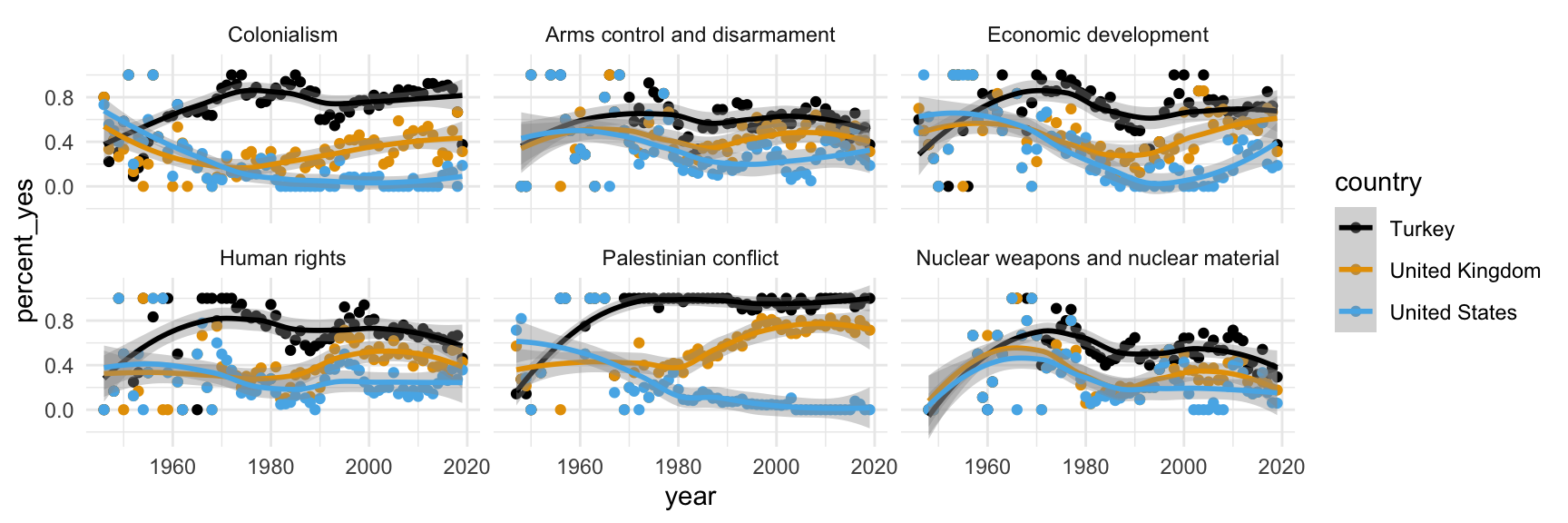
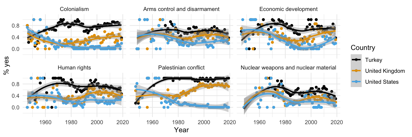
Step 10. Add labels
Participate 📱💻
Which of the following modifications will change the transparency of the points in the plot?
Scan the QR code or go to app.wooclap.com/sta199. Log in with your Duke NetID.
Step 11. Set transparency of points
with alpha
Step 12. Hide standard errors of curves
with se = FALSE
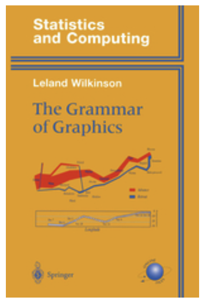
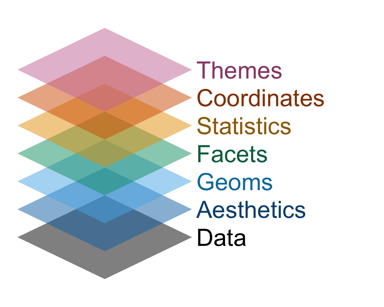
Grammar of graphics
We built a plot layer-by-layer
- just like described in the book The Grammar of Graphics and
- implemented in the ggplot2 package, the data visualization package of the tidyverse.