HW 2
Deeper dive into Midwest and NC Counties
Introduction
This is a two-part homework assignment:
Part 1 – 🤖 Feedback from AI: Not graded, for practice, you get immediate feedback with AI, based on rubrics designed by the course instructor. Complete in
hw-2-part-1.qmd, no submission required.Part 2 – 🧑🏽🏫 Feedback from Humans: Graded, you get feedback from the course instructional team within a week. Complete in
hw-2-part-2.qmd, submit on Gradescope.
By now you should be familiar with how to get started with a homework assignment by cloning the GitHub repo for the assignment.
Click to expand if you need a refresher on how to get started with a homework assignment.
- Go to https://cmgr.oit.duke.edu/containers and login with your Duke NetID and Password.
- Click
STA199under My reservations to log into your container. You should now see the RStudio environment. - Go to the course organization at github.com/sta199-f25 organization on GitHub. Click on the repo with the prefix hw-2. It contains the starter documents you need to complete the homework.
- Click on the green CODE button, select Use SSH. Click on the clipboard icon to copy the repo URL.
- In RStudio, go to File ➛ New Project ➛Version Control ➛ Git.
- Copy and paste the URL of your assignment repo into the dialog box Repository URL. Again, please make sure to have SSH highlighted under Clone when you copy the address.
- Click Create Project, and the files from your GitHub repo will be displayed in the Files pane in RStudio.
By now you should also be familiar with guidelines for formatting your code and plots as well as your Git and Gradescope workflow.
Click to expand if you need a refresher on assignment guidelines.
Code
Code should follow the tidyverse style. Particularly,
- there should be spaces before and line breaks after each
+when building aggplot, - there should also be spaces before and line breaks after each
|>in a data transformation pipeline, - code should be properly indented,
- there should be spaces around
=signs and spaces after commas.
Additionally, all code should be visible in the PDF output, i.e., should not run off the page on the PDF. Long lines that run off the page should be split across multiple lines with line breaks.
Plots
- Plots should have an informative title and, if needed, also a subtitle.
- Axes and legends should be labeled with both the variable name and its units (if applicable).
- Careful consideration should be given to aesthetic choices.
Workflow
Continuing to develop a sound workflow for reproducible data analysis is important as you complete the lab and other assignments in this course.
- You should have at least 3 commits with meaningful commit messages by the end of the assignment.
- Final versions of both your
.qmdfile and the rendered PDF should be pushed to GitHub.
Part 1 – Feedback from AI
Your answers to the questions in this part should go in the file hw-2-part-1.qmd.
Instructions
Write your answer to each question in the appropriate section of the hw-2-part-1.qmd file. Then, highlight your answer to a question, click on Addins > AIFEEDR > Get feedback. In the app that opens, select the appropriate homework number (2) and question number. Then click on Get Feedback. Please be patient, feedback generation can take a few seconds. Once you read the feedback, you can go back to your Quarto document to improve your answer based on the feedback. You will then need to click the red X on the top left corner of the Viewer pane to stop the feedback app from running before you can re-render your Quarto document.
Click to expand if you want to review the video that demonstrates how to use the AI feedback tool.
Packages
In this part you will work with the tidyverse package, which is a collection of packages for doing data analysis in a “tidy” way.
Data
We will use the midwest data frame once again for this homework. The data contains demographic characteristics of counties in the Midwest region of the United States. Because the data set is part of the ggplot2 package, you can read documentation for the data set, including variable definitions by typing ?midwest in the Console or searching for midwest in the Help pane.
Questions
Question 1
Calculate the number of counties in each state and display your results in descending order of number of counties.
Which state has the highest number of counties, and how many?
Which state has the lowest number, and how many?
Render, commit, and push your changes to GitHub with the commit message “Added answer for Question 1”.
Make sure to commit and push all changed files so that your Git pane is empty afterward.
Question 2
While two counties in a given state can’t have the same name, some county names might be shared across states. A classmate says
“Look at that, there is a county called
___in each state in this dataset!”
In a single pipeline, discover all counties that could fill in the blanks. Your response should be a data frame with only the county names that could fill in the blank and the number of times they appear in the data, and narrative stating the county names that could fill in this blank.
You will want to use the filter() function in your answer, which requires a logical condition to describe what you want to filter for. For example, filter(x > 2) means filter for values of x greater than 2, and filter(y <= 3) means filter for values of y less than or equal to 3.
The table below is a summary of logical operators and how to articulate them in R.
| operator | definition |
|---|---|
< |
less than |
<= |
less than or equal to |
> |
greater than |
>= |
greater than or equal to |
== |
exactly equal to |
!= |
not equal to |
x & y |
x AND y
|
x | y
|
x OR y
|
is.na(x) |
test if x is NA
|
!is.na(x) |
test if x is not NA
|
x %in% y |
test if x is in y
|
!(x %in% y) |
test if x is not in y
|
!x |
not x
|
Render, commit, and push your changes to GitHub with the commit message “Added answer for Question 2”.
Make sure to commit and push all changed files so that your Git pane is empty afterward.
Question 3
Return to the following box plot of population densities where you were asked to identify at least one outlier.
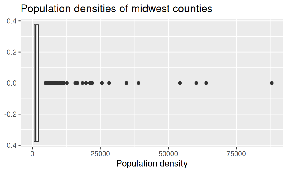
In this question, we want you to revisit this box plot and identify the counties described in each section.
The counties with a population density higher than 25,000. Your code must use the
filter()function.The county with the highest population density. Your code must use the
max()function.
Answer using a single data wrangling pipeline for each part. Your response should be a data frame with five columns: county name, state name, population density, total population, and area, in this order. If your response has multiple rows, the data frame should be arranged in descending order of population density.
Render, commit, and push your changes to GitHub with the commit message “Added answer for Question 3”.
Make sure to commit and push all changed files so that your Git pane is empty afterward.
Question 4
In HW 1 you were also asked to describe the distribution of population densities. The following is one acceptable description that touches on the shape, center, and spread of this distribution. Calculate the values that should go into the blanks.
The distribution of population density of counties is unimodal and extremely right-skewed. A typical Midwestern county has population density of
____people per unit area. The middle 50% of the counties have population densities between____to____people per unit area.
Think about which measures of center and spread are appropriate for skewed distributions.
Now is another good time to render, commit, and push your changes to GitHub with an informative and concise commit message.
Once again, make sure to commit and push all changed files so that your Git pane is empty afterwards.
Question 5
Another visualization from HW 1 was the following, which showed the proportion of urban (located in metropolitan area) counties in each state.
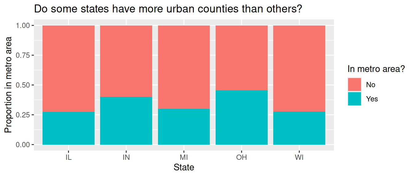
Calculate these proportions in a single data pipeline.
Remember, you’ll first need to create a new variable called metro which takes on the value Yes if the value of inmetro is 1, and No otherwise. You can refer to HW 1 if you need a refresher on how to do this.
Now is another good time to render, commit, and push your changes to GitHub with an informative and concise commit message.
And once again, make sure to commit and push all changed files so that your Git pane is empty afterward. We keep repeating this because it’s important and because we see students forget to do this. So take a moment to make sure you’re following along with the version control instructions.
Part 2 – Feedback from Humans
Your answers to the questions in this part should go in the file hw-2-part-2.qmd.
Packages
You will use the tidyverse package for data wrangling and visualization, scales for better axis labels, and ggbeeswarm for additional geoms.
Data
For the remaining questions on the homework, you will continue use data on counties in North Carolina that you used in HW 1.
As a reminder, the dataset contains information on North Carolina counties retrieved from the 2020 Census as well as from myFutureNC Dashboard maintained by Carolina Demography at the University of North Carolina at Chapel Hill.
This dataset is stored in a file called nc-county.csv in the data folder of your project/repository.
The variables in the dataset and their descriptions are the same as in HW 1:
-
county: Name of county. -
land_area_m2: Land area of county in meters-squared, based on the 2020 census. -
land_area_mi2: Land area of county in miles-squared, based on the 2020 census. -
pop_2020: Population of county, based on the 2020 Census. -
pop_dens_2020: Population density calculated as population (pop_2020) divided by land area in miles-squared (people per mile-squared). -
county_type: Peer county type classification based on population characteristics, socioeconomic status, and geographic features used for grouping counties with similar demographic, social, and economic characteristics, allowing them to be compared and benchmarked against one another. -
median_hh_income: Median household income. -
p_foreign_born: Percentage of population that is foreign-born. -
p_child_poverty: Percentage of children living in poverty. -
p_single_parent_hh: Percentage of households with children that are single-parent households. -
p_broadband: Percentage of households with broadband internet access. -
p_home_ownership: Percentage of homes that are owner-occupied. -
p_family_sustaining_wage: Percentage of adults that earn a family-sustaining wage – typically a wage that covers essential costs like housing, food, childcare, transportation, and healthcare for a family’s basic needs within a specific geographic area -
p_edu_lths: Percentage of 25-44-year-olds with less than a high school diploma. -
p_edu_hsged: Percentage of 25-44-year-olds with a high school diploma or equivalent. -
p_edu_scnd: Percentage of 25-44-year-olds with some college or an associate degree. -
p_edu_ndc: Percentage of 25-44-year-olds with non-degree credentials – certifications, licenses, or other credentials that demonstrate specific skills or knowledge but do not confer a formal academic degree. -
p_edu_assoc: Percentage of 25-44-year-olds with an associate degree. -
p_edu_ba: Percentage of 25-44-year-olds with a bachelor’s degree. -
p_edu_mapl: Percentage of 25-44-year-olds with a master’s, professional, or doctoral degree. -
p_edu_hs_grad_rate: High school graduation rate. -
p_edu_chronic_absent_rate: Chronic absenteeism rate.
You can read this file into R with the following code:
nc_county <- read_csv("data/nc-county.csv")Questions
Question 6
Report the number of rows and columns in
nc_county.-
Create a new variable called
p_edu_he(short for “percentage of population with higher education”) that is the sum of the percentages of- 25-44-year-olds with some college or an associate degree (
p_edu_scnd), - non-degree credentials (
p_edu_ndc), - an associate degree (
p_edu_assoc), - a bachelor’s degree (
p_edu_ba), and - a master’s, professional, or doctoral degree (
p_edu_mapl).
and store this variable in the
nc_countydata frame.Then, report the number of rows and columns in
nc_countyafter adding this variable. - 25-44-year-olds with some college or an associate degree (
If you don’t create the new variable p_edu_he in part (b), you will not be able to answer the remaining parts of this question or any of the remaining questions on the homework.
Therefore, here is a quick check to make sure you created the variable correctly – after creating the variable, run the following code:
nc_county |>
  select(p_edu_he) |>
  slice_head(n = 3)
You should see the following output:
# A tibble: 3 × 1
  p_edu_he
     <dbl>
1    0.615
2    0.525
3    0.525
If you do not see this output, please revisit part (b) of this question and make sure you created the variable correctly. Ask for help on Ed or in office hours if you need assistance.
-
In a single pipeline, calculate the
- minimum,
- first quartile (25th percentile),
- median (50th percentile),
- mean,
- third quartile (75th percentile), and
- maximum
of
p_edu_he. In a single pipeline, calculate the same statistics as in the previous part, but for each
county_type.
Render, commit, and push your changes to GitHub with the commit message “Added answer for Question 6”.
Make sure to commit and push all changed files so that your Git pane is empty afterward.
Question 7
Using the variable you created in Question 6, re-create the following plot that shows the distribution of p_edu_he by county_type.
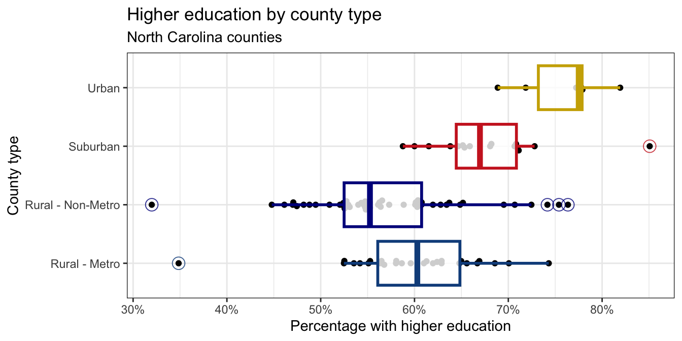
x-axis: You learned how to format the x-axis as percentages in class and had a hint about it in your previous homework assignment. You can use the same approach here.
Points: The points are drawn with the
geom_beeswarm()function from the ggbeeswarm package.Outliers: The outliers in the box plots are drawn as open circles. You can specify this with the
outlier.shapeargument ingeom_boxplot(). You can also adjust the size of the outliers with theoutlier.sizeargument. The ggplot2 aesthetic specifications documentation has a list of shape names you can use for help.Color palette: The colors for the box plots are manually specified in a
scale_color_manual()layer. You do not need to worry about the exact colors, but you should try to get close, e.g., use blue-ish colors for Rural counties, red-ish for Suburban, and brown-ish for Urban. You can use HEX codes for colors or look up named colors in R in the R colors cheatsheetTransparancy: You should adjust the transparency of the box plots. You don’t have to worry about the exact transparency value, but you should try to get close.
Theme: This plot uses a non-default theme. See theme options documentation for options.
Aspect ratio and width: You can adjust the aspect ratio and width of your plot in your rendered document by setting
fig-aspandfig-widthoptions in the code cell.
Render, commit, and push your changes to GitHub with the commit message “Added answer for Question 7”.
Make sure to commit and push all changed files so that your Git pane is empty afterward.
Question 8
In a single pipeline, identify the outliers in the plot in the previous question, and return a data frame with the county name, county type, percentage with higher education. This data frame should be arranged in ascending order of county type and descending order of percentage with higher education.
Render, commit, and push your changes to GitHub with the commit message “Added answer for Question 8”.
Make sure to commit and push all changed files so that your Git pane is empty afterward.
Question 9
Create a scatter plot with percentage of 25-44 year olds with higher education (p_edu_he) on the x-axis and median household income (median_hh_income) on the y-axis. Describe the relationship between these two variables. In your description, make sure to comment on the direction, form, strength, and any unusual observations. For unusual observations, identify the counties that correspond to these observations, and make sure to include the code you used to identify them as part of your answer. Your code should output the county name, percentage with higher education, and median household income for each unusual observation.
Requirements for the plot (in addition to the requirements in the overall assignment guidelines:
- The x-axis should be formatted as percentages, e.g., 30%, not 0.3.
- The y-axis should be formatted as dollar amounts, e.g., $40,000, not 4e+04.
Render, commit, and push your changes to GitHub with an informative and concise commit message.
Question 10
Come up with a question that you could answer with the nc_county data frame and the new p_edu_he variable you created in Question 6 and state it explicitly. Then, answer your question with an appropriate data visualization and/or data transformation pipeline and a brief description of your findings.
Render, commit, and push your changes to GitHub with an informative and concise commit message. Make sure to commit and push all changed files so that your Git pane is empty afterward.
Wrap-up
Before you wrap up the assignment, make sure that you render, commit, and push one final time so that the final versions of both your .qmd file and the rendered PDF are pushed to GitHub and your Git pane is empty. We will be checking these to make sure you have been practicing how to commit and push changes.
Submission
Submit your PDF document to Gradescope by the deadline to be considered “on time”:
- Go to http://www.gradescope.com and click Log in in the top right corner.
- Click School Credentials \(\rightarrow\) Duke NetID and log in using your NetID credentials.
- Click on your STA 199 course.
- Click on the assignment, and you’ll be prompted to submit it.
- Mark all the pages associated with question. All the pages of your homework should be associated with at least one question (i.e., should be “checked”).
Make sure you have:
- attempted all questions
- rendered your Quarto document
- committed and pushed everything to your GitHub repository such that the Git pane in RStudio is empty
- uploaded your PDF to Gradescope
Grading and feedback
Questions 1-5 are not graded, but you should complete them to get practice.
-
Questions 6-10 are graded, and you will receive feedback on Gradescope from the course instructional team within a week.
- Questions will be graded for accuracy and completeness.
- Partial credit will be given where appropriate.
- There are also workflow points for:
- committing at least three times as you work through your lab,
- having your final version of
.qmdand.pdffiles in your GitHub repository, and - overall organization.