── Attaching core tidyverse packages ──────────────────────── tidyverse 2.0.0 ──
✔ dplyr     1.1.4          ✔ readr     2.1.5
✔ forcats   1.0.0          ✔ stringr   1.5.1
✔ ggplot2   3.5.2          ✔ tibble    3.3.0.9004
✔ lubridate 1.9.4          ✔ tidyr     1.3.1
✔ purrr     1.1.0
── Conflicts ────────────────────────────────────────── tidyverse_conflicts() ──
✖ dplyr::filter() masks stats::filter()
✖ dplyr::lag()    masks stats::lag()
ℹ Use the conflicted package (<http://conflicted.r-lib.org/>) to force all conflicts to become errorsAE 01: Income inequality
Suggested answers
Application exercise
Answers
Important
These are suggested answers. This document should be used as a reference only; it’s not designed to be an exhaustive key.
Demo: Replace “Your Name” above with your actual name. Then, render the document to inspect the changes. Once you confirm you’re happy with the changes, commit your changes (with an appropriate commit message) by staging ALL of the changed files, and push them to GitHub. In your browser, navigate to your GitHub repository and confirm that the changes are reflected there.
The dataset we will explore is in the data folder and it’s called income-inequality.csv. It contains data on income inequality, measured by the GINI coefficient for different countries and years.
From Wikipedia:
A Gini coefficient of 0 reflects perfect equality, where all income or wealth values are the same. In contrast, a Gini coefficient of 1 (or 100%) reflects maximal inequality among values, where a single individual has all the income while all others have none.
In this dataset we have two Gini coefficients: one for income inequality before taxes and another for income inequality after taxes. These two values allow us to explore how much countries redistribute income. In addition, since we have data for multiple years, we can also explore how income inequality has changed over time.
Packages
For this application exercise, we’ll use the tidyverse package.
Demo: Run the code cell above and inspect the message printed in the Console.
Data
Let’s load the data.
income_inequality <- read_csv("data/income-inequality.csv")Rows: 549 Columns: 5
── Column specification ────────────────────────────────────────────────────────
Delimiter: ","
chr (2): country, country_code
dbl (3): year, gini_pre_tax, gini_post_tax
ℹ Use `spec()` to retrieve the full column specification for this data.
ℹ Specify the column types or set `show_col_types = FALSE` to quiet this message.And take a look at the first 10 rows.
income_inequality# A tibble: 549 × 5
country country_code year gini_pre_tax gini_post_tax
<chr> <chr> <dbl> <dbl> <dbl>
1 Australia AUS 1989 0.431 0.304
2 Australia AUS 1995 0.47 0.311
3 Australia AUS 2001 0.481 0.32
4 Australia AUS 2003 0.469 0.316
5 Australia AUS 2004 0.467 0.316
6 Australia AUS 2008 0.469 0.335
7 Australia AUS 2010 0.47 0.333
8 Australia AUS 2014 0.481 0.329
9 Australia AUS 2016 0.467 0.326
10 Australia AUS 2018 0.469 0.329
# ℹ 539 more rowsThe variables in the dataset are:
-
country: Country name -
country_code: Country code -
year: Year -
gini_pre_tax: Gini coefficient before taxes -
gini_post_tax: Gini coefficient after taxes
Demo: And take a look at the structure of the data as well with the glimpse() function.
glimpse(income_inequality)Rows: 549
Columns: 5
$ country <chr> "Australia", "Australia", "Australia", "Australia", "Aus…
$ country_code <chr> "AUS", "AUS", "AUS", "AUS", "AUS", "AUS", "AUS", "AUS", …
$ year <dbl> 1989, 1995, 2001, 2003, 2004, 2008, 2010, 2014, 2016, 20…
$ gini_pre_tax <dbl> 0.431, 0.470, 0.481, 0.469, 0.467, 0.469, 0.470, 0.481, …
$ gini_post_tax <dbl> 0.304, 0.311, 0.320, 0.316, 0.316, 0.335, 0.333, 0.329, …Demo: Render, commit (with an appropriate commit message), and push your changes to GitHub.
Your turn: replace the blank below with the number of rows in the income_inequality data frame based on the output of the chunk below. Then, replace it with “inline code” and render again. Then, commit (with an appropriate commit message) and push your changes to GitHub.
The income_inequality data frame has 549 observations. Each observation represents a country in a given year.
Income inequality over time in a country
Let’s explore income inequality over time in a country.
income_inequality |>
  filter(country == "Denmark") |>
  pivot_longer(
    cols = contains("gini"),
    names_to = "gini_type",
    values_to = "gini_coefficient"
  ) |>
  mutate(
    gini_type = if_else(gini_type == "gini_pre_tax", "Pre-tax", "Post-tax"),
    gini_type = fct_relevel(gini_type, "Pre-tax", "Post-tax")
  ) |>
  ggplot(aes(x = year, y = gini_coefficient, color = gini_type)) +
  geom_line(linewidth = 1)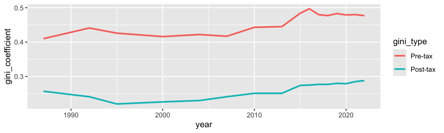
Your turn: Create a similar plot for another country of your choice by by modifying the code in the code cell labeled plot-single above. Then, render, commit (with an appropriate commit message), and push your changes to GitHub.
Hint: Open the data frame in the data viewer by clicking on its name in the Environment pane to see the list of countries.
Income inequality over time in many countries
Now let’s explore income inequality over time in many countries.
income_inequality |>
  filter(country %in% c("United States", "Sweden", "South Africa")) |>
  pivot_longer(
    cols = contains("gini"),
    names_to = "gini_type",
    values_to = "gini_coefficient"
  ) |>
  mutate(
    gini_type = if_else(gini_type == "gini_pre_tax", "Pre-tax", "Post-tax"),
    gini_type = fct_relevel(gini_type, "Pre-tax", "Post-tax")
  ) |>
  ggplot(aes(x = year, y = gini_coefficient, color = gini_type)) +
  geom_line(linewidth = 1) +
  facet_wrap(~country, ncol = 1)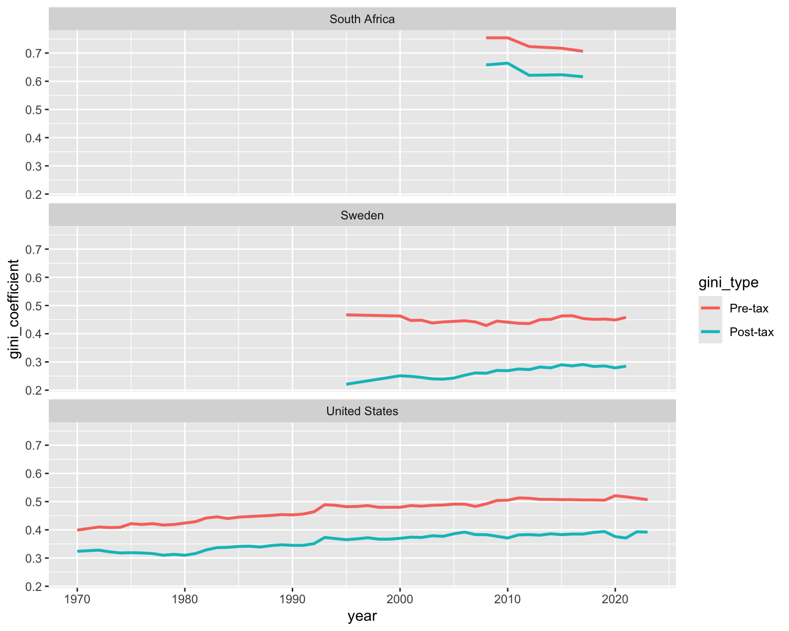
Your turn: Change as many countries as you like except for the United States by modifying the code in the cell labeled plot-many above. You can replace country names like we did before or add or remove them. Then, render to see your changes. Discuss your findings with your neighbor – Why did you choose those countries? How do the income inequalities of these countries compare? Finally, commit your changes (with an appropriate commit message), and push your changes to GitHub.